About the project
The PINCHme responsive website is a leading digital hub for members to sample and review products from the world's leading CPG brands for free. The business goal of this project is to grow member engagement and increase member retention rate. This case study is only to illustrate my process of product design. any confidential information is excluded. This case study does NOT reflect views of PINCHme Inc. All work/design/assets presented here is owned by PINCHme Inc.
My role
I was the lead product designer, working closely with the head of product, head of marketing, designers and developers on this project. I led the efforts to conduct user research, identify users' pain points, ideate design concepts, test and iterate on prototypes, determine feature priorities and requirements for development.
The Problem
Other than Sample Day(once/month), more than 62% of our members are not engaging with the PINCHme webapp platform
About 66% of deactivated users dropped out the user journey because they find no samples eligible for them to claim on Sample Day.
Hypothesis
Introducing a content-oriented member home page will increase user activities such as social sharing, reviewing products, entering sweepstakes, etc for member engagement and retention by 5% after Q1.
Risks and Assumptions


Stakeholders Interviews
To gather deeper insights about stakeholders' goals, I held meetings and conducted brainstorming sessions with them. We tried to answer questions like: as a CPG manufacturer, why partner with PINCHme but not someone else? What marketing content on PINCHme.com are useful to my brand? How do I want my targeted audience to engage with my brand? etc.
The key takeaways from these sessions greatly helped us to keep our business model up to date, prioritize features and define key performance indicators during this project.


User Research
In order to empathize with PINCHme members and identify their pain points, we've conducted users interviews to help us understand what really makes them continue engaging with our platform, and the challenges they have engaging with the experience. Based on findings from the research, we've elaborated on our user personas, empathy maps, and had a better idea of where potential opportunities lay.


Ideate
We went through a quick process of generating design alternatives and exploring a wide range of solutions.

Suggested Features
Here are some wireframe examples that I created to suggest minimum viable features.

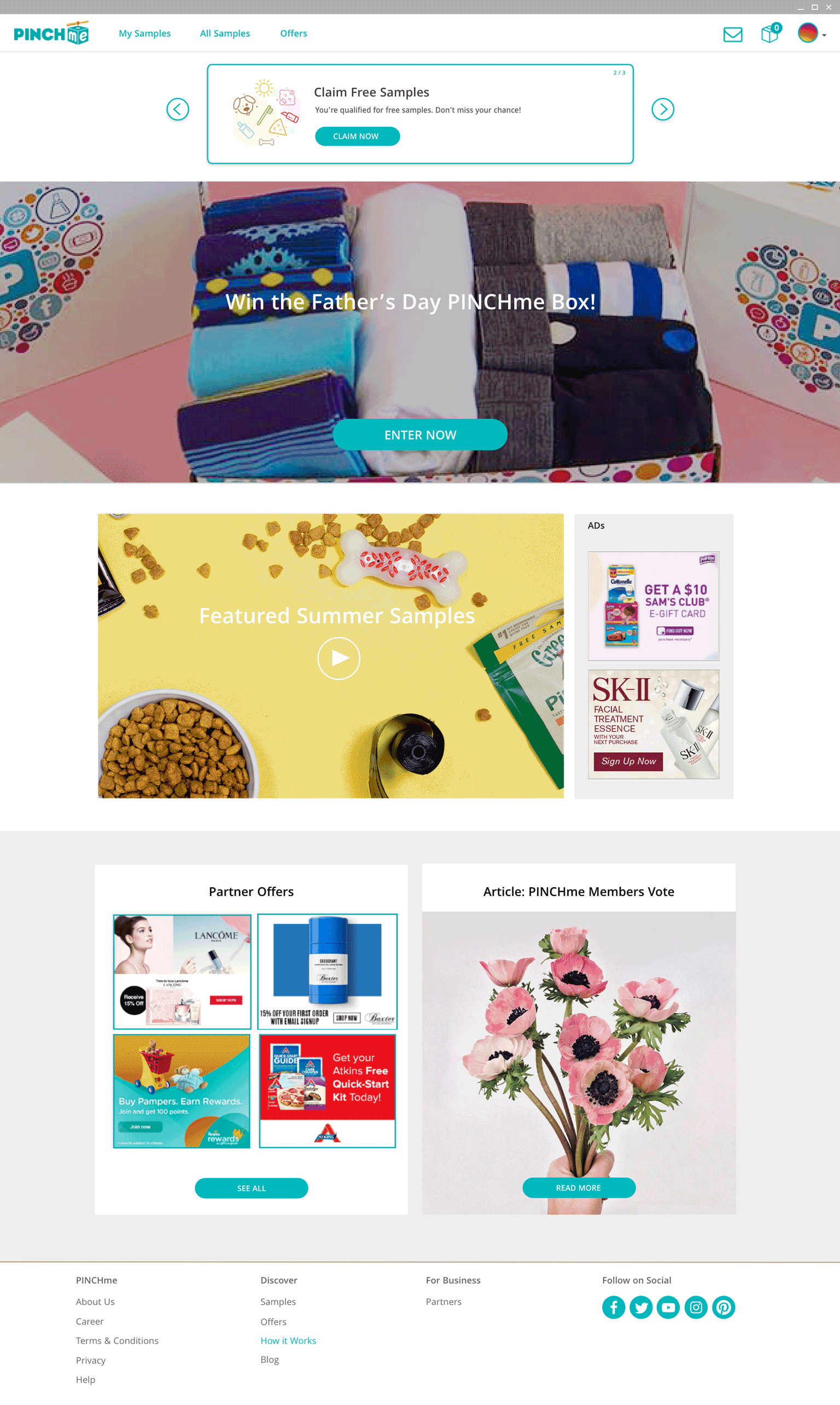
Member Home Page
Before, users land on the Samples Page upon login. They are disappointed when they find no samples available for them to claim. The new member home page intends to provide a space where members can not only claim samples but also explore rich content upon login, including special offers, sweepstakes, featured products, latest updates, etc.

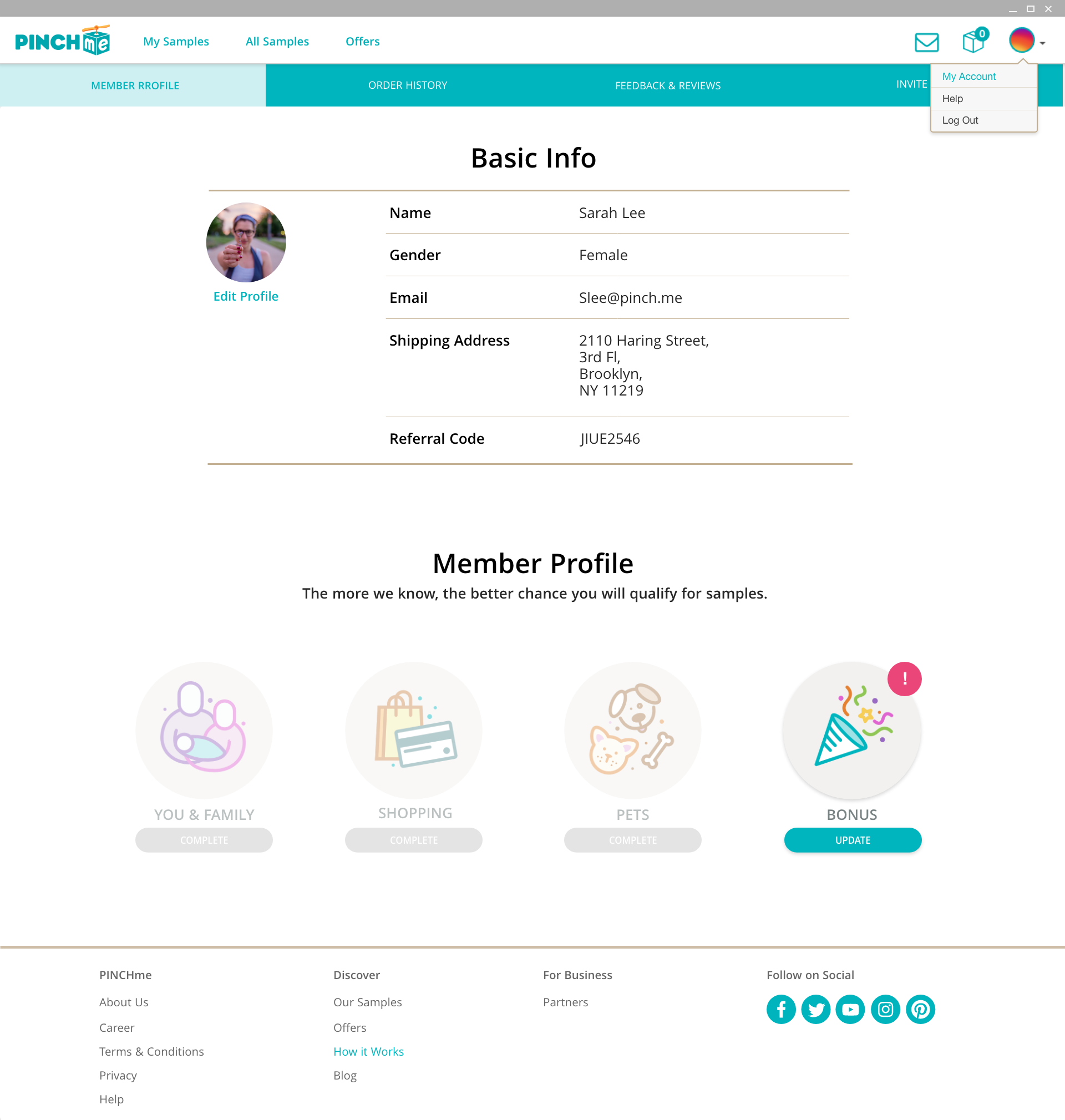
Review Rating
Based on our research, we have discovered that members are hesitant to provide product reviews. First, they are not sure how to begin writing. Second, there’s no clear guideline on how product review would affect their sample eligibility. The review rating feature guides members to write qualified product reviews, helps keep track of their review performance, and helps us to reward them with more free samples and offers.

Invite Friends
The Invite Friends feature intends to encourage existing members to invite their friends to join the PINCHme Community in an engaging way, by rewarding them with various sweepstakes entries.
Suggested feature Roadmap

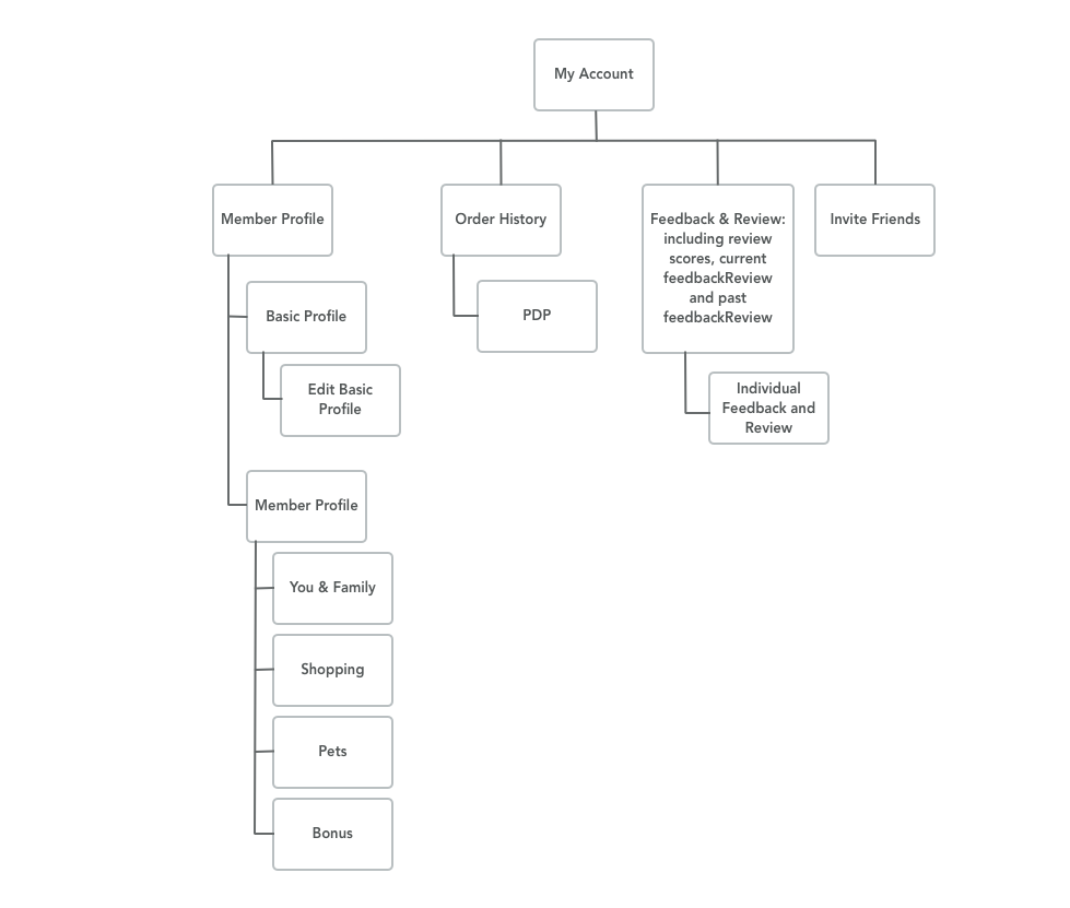
Sitemap & User Flow


Results
See below for examples from the final designs.